What Makes a High-Converting Product Page?
By Emma Pugsley, Co-founder ·
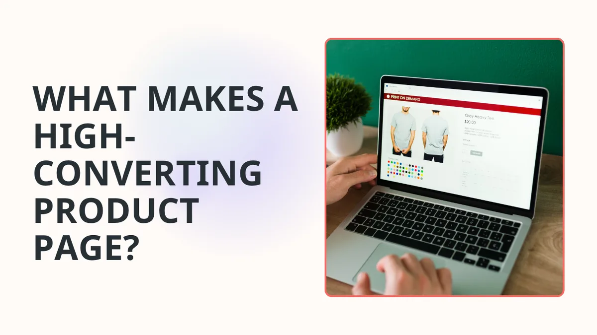
When you are getting visitors to your site you have to worry about sales. This is where it becomes important to optimise your web pages. In this article, we’ll look at product pages in particular. A functional page must explain the offer, resolve doubts, and facilitate a purchase. The following guide details ten methods to improve your product pages.
Why product pages matter
A high-converting product page makes the buying decision feel easy. It shows what the product is, why it matters, and why the visitor should trust it enough to buy now instead of leaving to think about it. For SMB e-commerce brands, that usually means the page does three jobs at once: it explains the offer clearly, removes doubt, and guides the shopper toward the add-to-cart button without making them work too hard.
The product page is where interest turns into intent. If the page is weak, the store can still get traffic but lose the sale because the visitor never gets enough clarity or confidence to move forward.
Baymard’s 2026 product page research says up to 62% of mobile e-commerce sites still have mediocre or worse product page UX, which shows how common this problem is.
1. Make the product obvious
A strong product page starts with clarity. The visitor should know what the product is, who it’s for, and what they’re actually buying within seconds.
That means the title, hero image, and first screen should work together. If the page needs a long explanation before it makes sense, the shopper has already had to do too much work.
✅ What to check:
- Clear product title
- Strong main image or short video
- Visible price
- A simple explanation of what the product does.
2. Lead with benefits, not specs
Specs matter, but buyers usually start with benefits. They want to know how the product will help them, not just what it’s made of.
The best pages translate features into outcomes. Instead of just listing details, they explain the real-world value in plain language.
A simple test: if the copy sounds like a product sheet instead of a buying argument, it probably needs work.
3. Use strong visuals
Images do a lot of the selling on a product page. They help shoppers judge quality, fit, style, size, and confidence before they ever read the full copy.

High-converting pages usually show the product from multiple angles and, when useful, include video or close-up detail shots. If the visuals feel thin, shoppers often assume the product is thin too.
✅ What to include:
- Multiple product images
- Lifestyle and detail shots
- Video when the product needs explanation
- Mobile-friendly media that loads fast.
4. Put trust where the decision happens
Trust signals should sit near the buying decision, not buried in the footer. Reviews, guarantees, delivery notes, and return reassurance all help reduce hesitation when the visitor is deciding whether to click.
Baymard and Shopify both point to trust as a major part of conversion, especially when the page is asking for money from a first-time visitor.
✅ Useful trust signals include:
- Star ratings and review counts
- Returns and shipping reassurance
- Credibility badges
- Social proof with images or real customer details.
For a wider view of the friction that stops buying across the whole site, read What Stops Visitors from Buying?

5. Make the CTA easy to act on
A product page can’t convert if the CTA is hard to find or awkward to use. The add-to-cart button should be visible, clear, and easy to tap, especially on mobile.
The best pages reduce hesitation right at the button. They don’t just say “buy now”; they make the action feel safe.
✅ What helps most:
- A visible primary CTA above the fold
- Sticky CTA on mobile
- Clear variant selection
- Fewer distractions around the button.
6. Answer objections before they become exits
Good product pages don’t wait for questions. They handle common objections before the shopper has to leave and search for answers elsewhere.
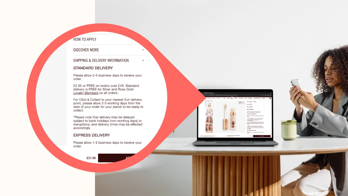
The usual objections are simple: Is this right for me? Can I trust this brand? How fast will it arrive? What if I change my mind?
The best pages answer those questions with short copy, FAQs, delivery notes, and policy clarity. That’s one reason product pages that feel complete usually convert better than pages that look polished but leave gaps.
7. Keep the page scannable
Shoppers don’t read every word. They scan for the parts that matter, then decide whether to keep going.
That means a high-converting page needs visual hierarchy. The most important information should stand out, the sections should have a clear order, and the page shouldn’t feel like one long wall of text.
✅ A good structure often looks like this:
- Product title and price
- Main image and CTA
- Short benefit summary
- Reviews or social proof
- Product details and specs
- FAQs and reassurance.
8. Make it work on mobile
Mobile is where product page problems get exposed fast. Baymard’s latest benchmark shows 62% of mobile sites still fall into mediocre or worse product page UX, so the mobile version has to do serious work.
If the page is crowded, slow, or hard to navigate on a phone, the conversion rate usually drops because the user has less patience and less space to think.

✅ Grab your phone and check these items:
- Can you see the CTA without effort?
- Can you choose a variant easily?
- Do the images load cleanly?
- Can you scroll through the page without friction?
9. Don’t overload the page
A common mistake is trying to say everything at once. Too many blocks, too much copy, too many option, and too many competing messages make the page harder to follow.
A better page keeps the story tight: what it is, why it’s useful, why it’s trustworthy, and how to buy it. Anything that doesn’t help that story should be questioned.
10. Use audits to spot the weak points
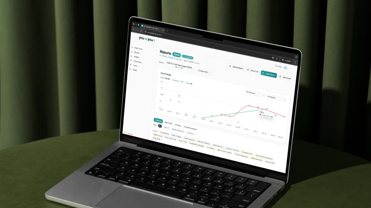
Most product pages don’t fail because of one dramatic mistake. They fail because several small things add up: weak images, unclear copy, poor trust placement, slow loading, and a CTA that isn’t doing enough work.
That’s why an audit is useful. It gives you a practical starting point instead of a vague list of “best practices.”
That’s why you x you i turns product-page friction into a simple, prioritized fix list that any small team can use.
Final takeaway
A high-converting product page is clear, trustworthy, and easy to act on. It makes the product obvious, shows the value fast, answers objections early, and gives the shopper a simple path to buy.
If a product page has traffic but weak sales, the fix is usually not more traffic. It’s a better page.