
Why Your Shopify Store Gets Traffic but Not Sales
By Emma Pugsley, Co-founder ·

Getting traffic but no sales usually means one thing: your store is attracting attention, but something in the buying journey is making people hesitate or leave. For small Shopify brands, the issue is often not a total lack of demand, but a mix of mismatched traffic, weak product pages, low trust, mobile friction, or checkout issues that block orders.
That is exactly the kind of problem you x you i is built for. The tool is a fast, low-risk website check-up for small e-commerce teams that already have traffic, but don’t have clear, affordable user experience guidance on what to fix first. Instead of adding more tools or chasing another redesign, the goal is to find the friction that is already costing sales.
Why traffic alone is not enough
Traffic is only useful if it is the right traffic and if the page meets the visitor with enough clarity and trust to keep them moving. Many founders see sessions going up and assume the hard part is done, but if visitors are not adding to the cart or are dropping off during checkout, the store has a conversion problem, not just a traffic problem.
This is especially common for growing SMB stores. Our customers are usually spending on ads or content, can already see that traffic is arriving, and feel the frustration of not knowing why that traffic isn’t turning into orders. Their main need is simple: show what is wrong, in plain language, and in the right order to fix it.
1. The traffic may be wrong
Not every visitor is close to buying. If traffic is coming from broad keywords, weak ad targeting, or social posts that create curiosity without purchase intent, the store can look busy while revenue stays flat.
A quick check helps:
- Are visitors landing on pages that match the promise in the ad, post, or search result?
- Are product pages built for first-time visitors, or do they assume too much prior context?
- Is the traffic mostly mobile, while the site works better on desktop?
🚫 If the answer to any of those is no, the problem may start before the page design even has a chance to convert.
2. Your product page is not doing enough work
A product page has a short window to answer the questions buyers actually care about: what this is, why it matters, how much it costs, whether it is worth trusting, and what happens next. When those answers are buried, vague, or missing, visitors leave even if they were genuinely interested.
Baymard’s CRO guidance consistently points back to the same basics: strong product information, reduced friction, and clearer decision support. In practical terms, that usually means:
- a clear product title and benefit-led opening copy
- images that help the customer understand the item fast
- visible shipping, returns, and delivery information near the buying decision
- reviews, proof, and reassurance close to the Add-to-Cart area.
🚫 If this part feels weak, start with your product pages before changing your ads.
For a deeper look at what strong pages do better, read The Most Common UX Mistakes on SMB Stores.
3. Your store does not feel trustworthy enough
Many visitors will not buy from a store they do not fully trust, even if they like the product. That hesitation gets stronger for new or unfamiliar brands, especially when the site feels inconsistent, thin, or unfinished.
Trust signals don’t need to be flashy. They just need to answer the questions buyers ask before paying:
- Is this brand real?
- Can I return this if needed?
- Will my payment be safe?
- Have other people bought from here?
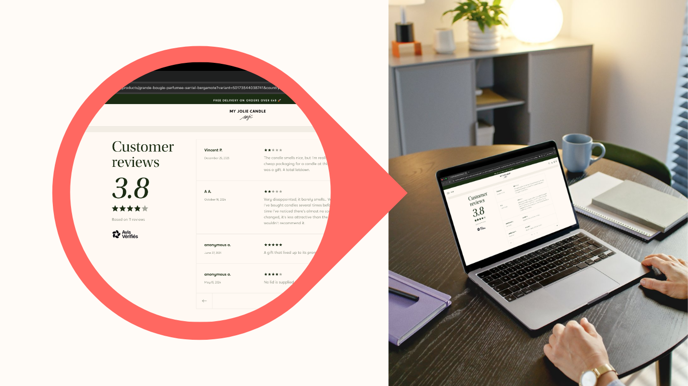
On the you x you i site, trust signals are treated as one of the core parts of every audit because they directly affect whether visitors feel safe enough to act. For many SMB brands, better trust blocks, clearer policies, and stronger page consistency can unlock more sales without changing the offer itself.
4. Mobile friction is blocking conversions
A store can look fine on a desktop and still leak sales on mobile. This matters because mobile traffic is often a large share of e-commerce visits, and small issues feel much bigger on a smaller screen.
Common mobile problems include:
- Tiny or low-contrast buttons
- Important information pushed too far down the page
- Menus or layouts that feel awkward on smaller screens
- Slow or unstable page loads.
This is one reason you x you i focuses on plain-English fixes instead of design jargon. The real question isn’t whether the page is “beautiful.” It’s whether a customer on their phone can understand, trust, and buy without friction.
If mobile is underperforming, it is worth reviewing your site with a quick audit.
5. Checkout is where the sale dies
Sometimes the site is doing its job until the final stretch. Visitors browse, click, and even add to cart, then disappear. That usually points to checkout friction, not top-of-funnel failure.
The most common reasons include:
- Surprise shipping costs
- Forced account creation
- Limited payment options
- Too many steps or form fields.
Baymard includes checkout simplification among the most important CRO improvements for e-commerce sites because it removes friction at the moment the buyer is ready to act. If you are seeing add-to-carts but not purchases, this is one of the first places to inspect.
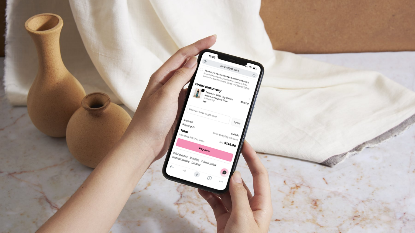
You can also continue with Checkout Optimization: Fix the Last Mile Before Purchase for a more focused breakdown.
6. The offer may not feel strong enough yet
Not every sales problem is a UX problem. Sometimes the page is reasonably usable, but the offer is not compelling enough for the traffic arriving. That can mean the price feels off, the value is unclear, the positioning is too generic, or the urgency to buy is weak.
This is where founders often get stuck. They keep adjusting theme settings or adding apps when the real issue is that the page doesn’t make the product feel distinct or worth acting on right now. The answer is rarely “add more stuff.” It is usually “make the value proposition clearer and the decision easier.”
A quick way to diagnose the problem
Here is a simple read on what your numbers may be telling you:
- Traffic but no add-to-carts: likely traffic mismatch, weak landing page clarity, or trust issues
- Add-to-carts but no purchases: likely checkout friction, hidden costs, or payment concerns
- Mobile traffic is much worse than desktop: likely usability or speed problems on smaller screens
- One product sells, others do not: likely page quality, positioning, or offer clarity issues.
That kind of pattern reading is useful because it stops the usual cycle of guessing, over-editing, and hoping the next app fixes it.
What to fix first
If time is tight, start here:
- Tighten your product page messaging and proof
- Add trust signals near the point of decision
- Remove friction from checkout
- Check the mobile experience on a real phone, not just in a browser preview
- Make sure the traffic source matches the landing page promise.
That order fits both the problem pattern seen in Shopify “traffic but no sales” discussions and the practical needs of small teams that need a short, prioritised fix list.
The next step
If your store is getting visits but not enough orders, do not start with another redesign. Start with a quick check-up that shows what’s blocking sales and what to fix first.
