Original Research: What Stops Visitors from Buying?
By Emma Pugsley, Co-founder ·

Most shoppers don’t leave because of one dramatic flaw. They stop buying when a store stacks several small problems on top of each other: weak trust, unclear pricing, checkout friction, slow delivery, and pages that make the decision feel harder than it should. Baymard’s checkout research finds that 70.19% of all e-commerce visitors abandon their shopping cart, and its abandonment list shows the biggest avoidable reasons are extra costs, slow delivery, trust concerns, forced account creation, and complicated checkout.
This article turns that research into a practical map of what stops visitors from buying in SMB stores. The focus is not on theory; it’s on the issues that show up again and again when small teams already have traffic but still lose sales before the order is complete.
What the research says
The broad pattern is clear. Visitors usually stop buying when the site makes them feel uncertain, surprised, rushed, or forced. Baymard’s research says the average cart abandonment rate is 70.22%, and the most common avoidable reasons include extra costs being too high, delivery being too slow, not trusting the site with card information, being asked to create an account, and a checkout that feels too long or complicated.
That matches what Shopify and other e-commerce guidance keep warning about: weak product pages, poor checkout flow, neglected mobile users, and unclear site structure all make the decision harder. For SMB stores, the problem is rarely a lack of interest. It is usually a lack of confidence at the moment the visitor is supposed to act.
1. Surprise costs
The biggest avoidable blocker is cost surprise. Baymard’s abandonment data shows that extra costs, including shipping, taxes, and fees, are the top reason shoppers bail, and a separate checkout summary lists the same issue as the single largest avoidable cause.
This is one of the fastest ways to lose trust. A visitor may like the product, but if the final total appears late or feels bigger than expected, the purchase suddenly feels risky. For SMB stores, the fix is usually simple: show shipping expectations earlier, surface the real total sooner, and avoid making the final step feel like a bait-and-switch.
2. Slow delivery
The next major blocker is delivery time. Baymard’s abandonment statistics show that 21% of shoppers who abandon do so because delivery is too slow, and other recent summaries point to the same issue as one of the main reasons people leave.
This isn’t just a logistics problem; it’s a conversion problem. If the site doesn’t make delivery timing easy to understand early enough, visitors assume the worst and move on. SMB stores often focus on product pages and forget that shipping clarity is part of the sale, not a post-purchase detail.
3. Trust concerns
Trust is one of the most important purchase blockers, especially for newer or smaller brands. Baymard’s data says 19% of shoppers who abandon do so because they don’t trust the site with card information, and other summaries show trust and security concerns consistently near the top of abandonment reasons.
That trust problem usually shows up in small, ordinary ways: weak reassurance near checkout, missing reviews, hidden policy information, or a page that feels less polished than the promise. If the store doesn’t answer the customer’s safety questions fast enough, the customer simply stops.
For a deeper look at how trust breaks down on pages, see What Makes a High-Converting Product Page?

4. Forced account creation
Another common blocker is being forced to create an account before buying. Baymard reports that 19% of abandoned carts come from sites that require account creation, and its checkout research treats account selection as one of the major friction points.
This issue is easy to underestimate because it feels small to the team building the store. To the visitor, though, it is one more thing between interest and payment. If the goal is to reduce hesitation, guest checkout and delayed account creation are usually better than demanding sign-up too early.
5. Checkout feels too long
A long or complicated checkout is still one of the most reliable reasons people leave. Baymard’s abandonment data shows 18% of shoppers leave because checkout is too long or complicated, and its usability research says the average site still has far more form elements than an ideal flow needs.
This is why checkout simplification keeps coming up in both research and practical e-commerce advice. The more steps, fields, and decisions you add, the more chances you give a visitor to hesitate or make a mistake.
6. Returns feel unclear or weak
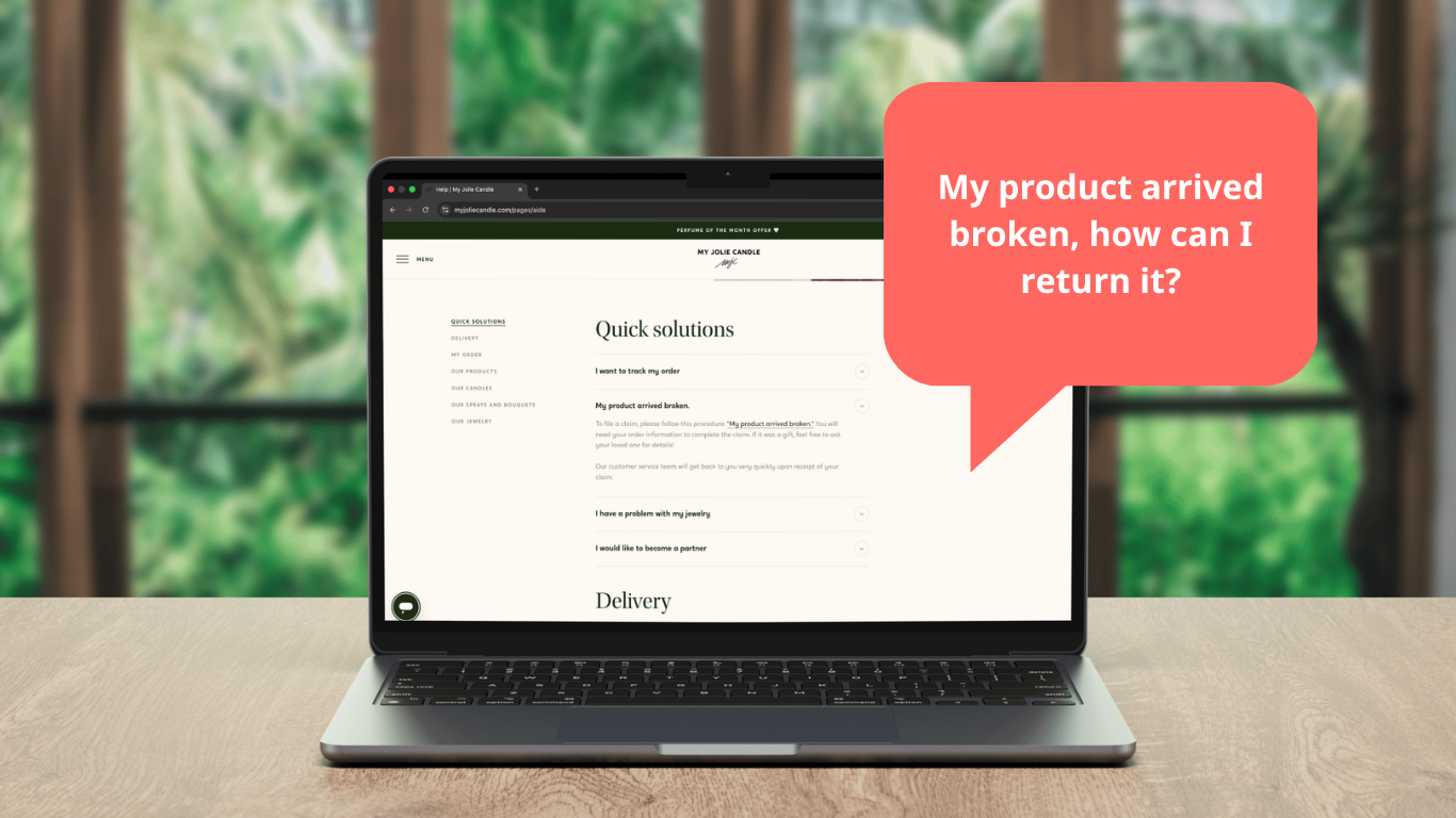
Returns policy is one of the blockers that can still stop a sale. Baymard’s abandonment data shows that 15% of shoppers leave because the returns policy is not satisfactory, which means policy clarity matters before the order is placed, not just after.
This is especially true for SMB stores that rely on trust rather than brand fame. If the policy is hard to find, too strict, or written in language that sounds defensive, visitors often treat that as a warning sign. In practice, a clear returns promise can remove more hesitation than another promotional banner ever will.
7. The site feels unstable
Some visitors stop buying because the site itself feels unreliable. Baymard’s abandonment list includes 15% who left because the website had errors or crashed, which is a direct signal that technical friction can erase intent fast.
Even small issues matter here. A button that doesn’t respond, a page that reloads badly, or a form that breaks on mobile is often enough to end the purchase. For SMB teams, reliability is part of UX, not a separate technical concern.
8. The total is unclear
People also stop buying when they can’t see the full order cost early enough. Baymard’s data shows that 14% abandon because they could not see or calculate the total cost upfront, which means the buyer feels forced to commit before they understand the real price.
That’s a simple trust problem disguised as a pricing issue. If the customer has to click through several steps to understand what they will pay, the site creates doubt instead of confidence. Clear totals, obvious fees, and visible delivery costs remove that doubt much earlier.
9. Not enough payment options

Payment flexibility still matters. Baymard reports that 10% of abandoned carts occur because there aren’t enough payment methods, which aligns with broader checkout guidance on payment flow and method variety.
This isn’t about adding every possible payment brand. It’s about matching the expectations of the store’s real audience and making the payment step feel familiar. When the only option feels awkward or limiting, some visitors simply choose not to continue.
10. Mobile friction makes everything worse
Mobile doesn’t create every problem, but it amplifies all of them. Baymard’s mobile usability research and broader e-commerce research both point to the same pattern: small screens make usability mistakes feel larger and more annoying.
If the mobile version has tiny tap targets, long scrolling, weak spacing, or awkward checkout fields, the buyer has less patience to work through the problem. For SMB stores, mobile friction often explains why a product looks fine in desktop analytics but still underperforms in revenue.
The pattern behind the exits
The core pattern is not mysterious. Visitors stop buying when the store makes them do too much work, feel too much uncertainty, or absorb too many surprises at once.
That’s why the same issues keep appearing across research: price surprise, delivery clarity, trust, account friction, checkout length, returns, technical stability, payment options, and mobile usability. On SMB stores, these problems often show up together, which is why small changes can create a disproportionate lift when they remove several blockers at once.
What to fix first
For most SMB stores, the best order is:
- Show the total cost earlier
- Make delivery expectations clear
- Strengthen trust signals near the point of purchase
- Allow guest checkout or delayed account creation
- Reduce checkout steps and fields
- Check the mobile journey from the product page to payment.
That sequence starts with the biggest reasons visitors leave and works backwards toward the point of purchase. It also fits the way you x you i is positioned: fast audits that show what is blocking sales and what to fix first.
Final takeaway
What stops visitors from buying is usually not one big failure. It’s a cluster of small blockers that make the decision feel expensive, uncertain, annoying or just wrong.
The good news is that most of those blockers are fixable. A clear pricing path, stronger trust, better delivery communication, simpler checkout, and cleaner mobile UX can do more than another round of guesswork.