
Website UX Basics for Small E-commerce Teams
By Emma Pugsley, Co-founder ·

Website UX (user experience) is the part of your site that decides whether visitors feel confident enough to buy. For small e-commerce teams, a good UX usually means fewer confused visitors, fewer abandoned carts, fewer time-consuming fixes, and happier customers.
This guide keeps the basics simple. The goal is to show what matters most on a small store and what to prioritise to make the site easier to use without turning it into a huge project.
Why UX matters
A lot of small stores focus on traffic before the site is ready to convert it. But if the layout is confusing, the copy is vague, the pages take too long to load, or the mobile version is awkward, visitors leave before they ever get to checkout.
Baymard’s 2026 research keeps showing the same pattern across e-commerce: confidence, comparison, and commitment are where friction shows up most often. That means UX isn’t about decoration. It’s about helping people decide and act with less effort.
1. Make the purpose obvious
A good e-commerce page should make its purpose clear fast. Visitors should understand what the site sells, who it’s for, and what they’re supposed to do next without having to decode the page.
If the homepage or product page feels clever but unclear, people need to work too hard. That usually lowers trust and makes them leave.
✅ What to check:
- Clear headlines
- Simple page structure
- One obvious primary action
- Copy that explains the offer in plain language.
2. Keep navigation simple
Navigation should help people move, not make them think. For small e-commerce teams, that means short menus, descriptive labels, and a site structure that matches how shoppers actually browse.
Too many levels, unclear categories, jargon labels, or hidden paths make the site harder to use and harder to crawl. Good structure helps both visitors and search engines.
✅ What to improve:
- Use clear category names
- Keep top-level menus short
- Add search where it helps
- Make breadcrumbs and filters easy to use.
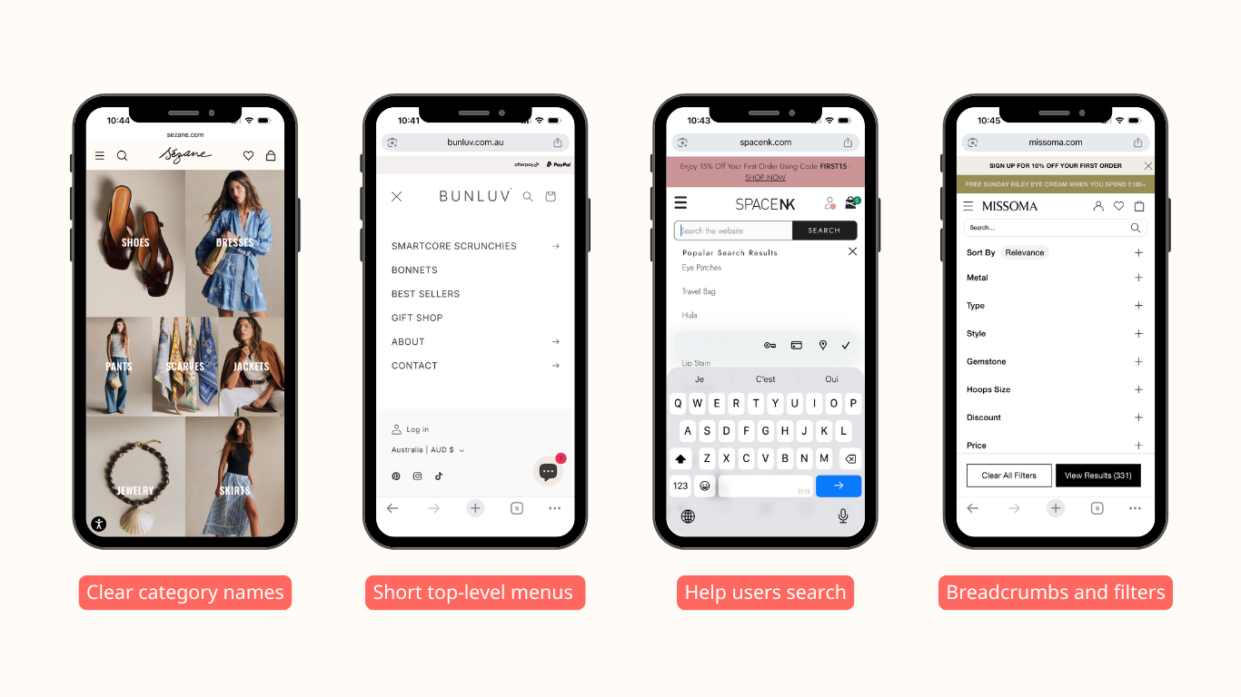
For good examples, take a look at: Sezanne for clear category names
Bunluv for short top-level menus
SpaceNK helps users with search
Missoma provides a lot of filters
3. Design for mobile first
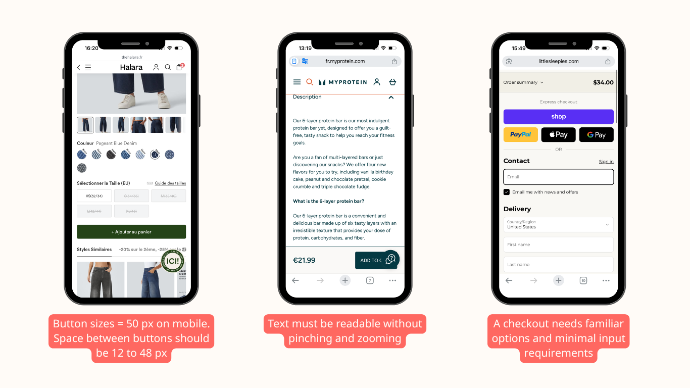
Mobile UX is where a lot of e-commerce problems get exposed. On smaller screens, clutter, tiny buttons, awkward spacing, and long forms feel worse because the user has less room and less patience.
If the mobile version feels like a compressed desktop site, it usually needs work. Small teams should review the full purchase path on a phone, not just the desktop version.
✅ What to check on mobile:
- Button size and spacing
- Readability
- Page length
- Whether product and checkout flows feel smooth.
4. Make product pages easy to scan
Product pages are where most buying decisions happen. That page should answer the main questions quickly: what it is, why it matters, how much it costs, and why it’s worth buying now.
Baymard’s product page research shows that many e-commerce sites still have mediocre product page UX, especially on mobile. That makes product pages one of the best places to start improving UX.
✅ A better product page usually includes:
- A clear title and price
- Strong images
- Short benefit-focused copy
- Reviews and trust signals
- A visible add-to-cart button.
For a deeper breakdown, see What Makes a High-Converting Product Page?
5. Reduce friction in checkout
Checkout should feel like the easiest part of the whole journey. If it’s long, confusing, or full of surprises, visitors will leave even if they were ready to buy.
Baymard’s checkout research keeps showing the same major issues: forced account creation, too many fields, unclear delivery timing, and hidden costs. Those are basic UX problems, but they still cause a lot of lost revenue.
✅ What to fix first:
- Offer guest checkout
- Keep forms short
- Show total costs early
- Make delivery timing clear
- Avoid distractions at the payment step.
If you want a focused breakdown of this stage, read Checkout Optimization: Fix the Last Mile Before Purchase
6. Use trust signals well
People buy when the site feels safe. Trust signals help lower hesitation, especially when the shopper doesn’t know the brand yet.
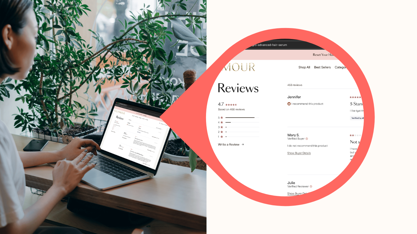
That doesn’t mean stuffing badges everywhere. It means putting the right reassurance in the right place: reviews near the decision, policies where people look for them, and contact details that make the brand feel real.
✅ Useful trust signals include:
- Reviews and ratings
- Returns and shipping details
- Real business information
- Support options that are easy to find.
7. Cut clutter
Clutter makes pages harder to scan and harder to trust. If a page has too many competing elements, visitors don’t know where to look first.
Small teams often add features when trying to fix conversion, but the site usually needs the opposite: fewer distractions, clearer hierarchy, and more whitespace around the important parts.
A simple rule helps here: if a section doesn’t help the visitor decide or act, question whether it belongs.
8. Keep speed and stability in view
UX and performance are connected. If pages load slowly or break on some devices, the experience feels worse even when it looks good.
That’s why site speed, clean code, responsive layouts, and stable page behavior are part of UX basics, not separate technical chores. Small stores don’t need perfection, but they do need a site that feels dependable.
9. Check the whole journey
A page can look fine on its own and still fail inside the larger journey. The homepage, collections, product pages, cart, and checkout should feel like one path, not separate experiments.
This is where many small stores lose momentum. The user clicks through, but the page structure, copy, or navigation changes too much from one step to the next.
If the path feels inconsistent, fix the handoff between pages before you add more features.
10. Start with an audit
The hard part of UX isn’t knowing that it matters. It’s knowing where the biggest problems are.
That’s why a short audit is useful. It helps small teams spot the highest-impact issues first, so they can make a few useful changes instead of chasing everything at once.
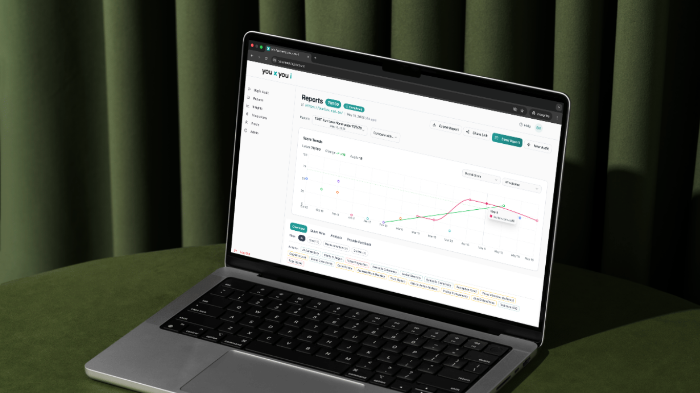
You x you i can help by turning UX basics into a plain-English list of fixes that show what’s blocking sales and what to do next.
What to do first
If the team is small, start here:
- Make the homepage and product pages clearer
- Simplify navigation
- Improve the mobile experience
- Add trust signals near decisions
- Remove checkout friction
- Review speed and layout stability.
That order keeps the work practical. It also focuses on the parts of UX that most directly affect whether a visitor can understand the site and buy from it.
Final takeaway
Website UX basics aren’t about making a site look polished for its own sake. They’re about making the buying path easier.
For small e-commerce teams, that’s usually the fastest way to turn existing traffic into more sales.