15 Fixes That Improve Sales
By Emma Pugsley, Co-founder ·

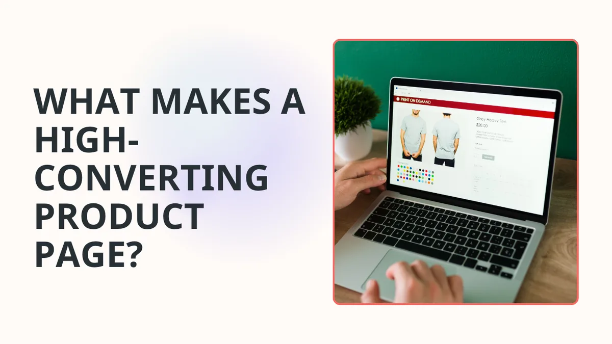
Your product page is where browsing turns into buying, or doesn’t. It’s the single highest-stakes page in your store, and most of the gap between a page that converts and one that doesn’t comes down to a handful of measurable elements: image quality, social proof, CTA prominence, and mobile experience.
Here are 15 fixes, in priority order, that consistently move the needle for SMB stores.
1. Lead with high-quality, multi-angle imagery
Strong product photography (multiple angles, lifestyle shots, and detail close-ups) is the single highest-impact conversion investment for most categories. Show the product in natural use, on diverse people, and zoomed in on texture and material.

2. Add a short product video
A 15–30 second muted, auto-play demo, a 360-degree spin, or a how-to clip answers questions static images can’t. It’s especially powerful for considered or complex purchases.
3. Keep the Add to Cart button above the fold
Around 80% of visitors never scroll past the first viewport, and the CTA must be immediately visible when they land. If your description pushes the button below the fold, redesign.
4. Make the CTA visually dominant
Preserve colour contrast, declutter the area around the button, make it tapable for big/clumsy thumbs, and make sure it stands out from everything else on the page. The buy action should be the most obvious thing on screen.

5. Respect the F-pattern hierarchy
Eye-tracking shows users scan in an F-pattern, so your most critical conversion elements (title, price, social proof, images) belong in the upper-left and across the top of the viewport.
6. Write clear, benefit-led titles
Keep titles short and specific, so shoppers instantly understand the offer, while including key features for context.
For more tips on giving shoppers clarity, read E-commerce SEO That Also Drives Sales
7. Match description length to the purchase
For impulse buys under $50, concise benefit bullets convert better than long copy; for considered purchases, give buyers the detail they need to research and compare.
8. Move detail into tabs and accordions
Use collapsible sections or product tabs so shoppers can explore gradually. This keeps the page uncluttered and the focus on the buy button.

9. Show reviews above the fold
Most stores hide reviews below the fold; pulling star ratings and social proof up near the top is one of the highest-leverage placements you can change.
10. Show user-generated content
Real customer photos and UGC build trust faster than studio shots alone.
11. Use honest urgency signals
Legitimate scarcity (like actual low-stock counts under 10, countdown timers on expiring offers, “47 people viewing”) lifts conversion by 8–32% in controlled A/B tests. The word that matters is honest; fake urgency erodes trust.
12. Make variant selection foolproof
Use swatches or buttons rather than ambiguous dropdowns, and label every option clearly so shoppers never second-guess what they’re adding to cart.
13. Nail the mobile experience
Add a sticky Add to Cart bar, full-width swipeable image carousels, 44×44px minimum tap targets, and one-tap Apple Pay / Google Pay. Most of your traffic is on a phone, so treat it as the primary layout, not an afterthought.
14. Hit your Core Web Vitals
Target LCP under 2.5s, INP under 200ms, and CLS under 0.1, with product images loading in under 1.5s on 4G. Serve compressed WebP images so speed never costs you the sale.
Run an audit with you x you i to see your site’s performance (and how to fix it).
15. Answer objections with an FAQ and smart recommendations
Add an FAQ section to handle common pre-purchase questions, and show a few genuinely complementary product recommendations, but not so many that you trigger decision paralysis.

Where to start
You can’t fix all 15 this week, so start with the four that explain most of the conversion gap:
- Image quality
- Social proof placement
- CTA prominence
- Mobile experience.
Change one element at a time and validate with an audit from you x you i.
Want to know which of these 15 is actually costing you sales right now?
Run a site check-up, and we’ll audit your product pages and show you the highest-impact fix first.