10 Website Teardowns: What High-Converting Sites Do Better
By Emma Pugsley, Co-founder ·
When you tear down enough websites, and at you x you i, we look at a lot of them; the high-converting ones start to rhyme. They rarely win with one clever trick. They win because they consistently get the same handful of fundamentals right while everyone else gets them almost right.
Here are 10 patterns that separate sites that convert from sites that merely exist. Read them as a teardown checklist for your own store.
1. The headline says what it is, instantly
High-converting sites pass the five-second test: land on the page, and you immediately know what they sell and who it’s for. Weaker sites lead with a vague slogan or a pretty hero image that communicates nothing. The fix is a clear value proposition supported by a subheadline that names the benefit and the audience.
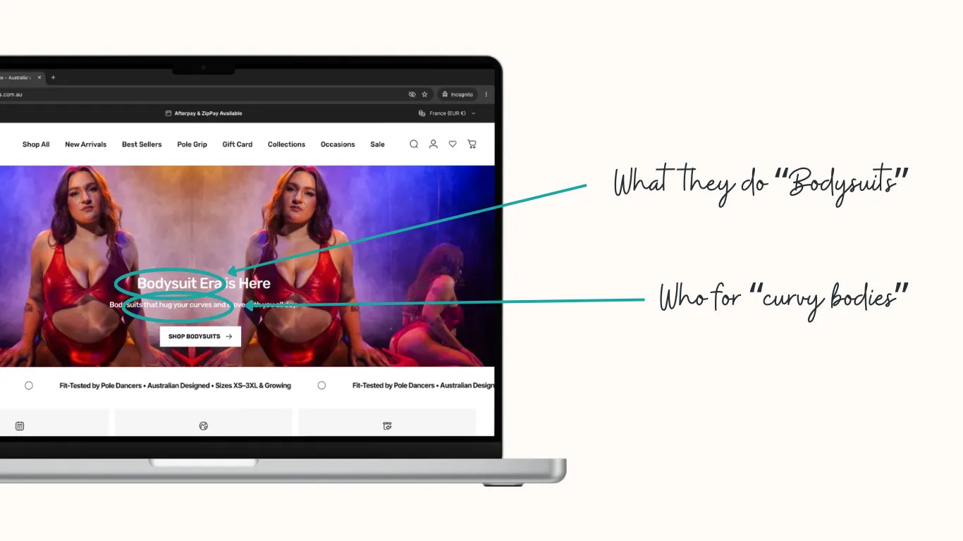 Take a look at https://rarrdesigns.com.au/ for a great example of a headline that passes the five-second test!
2. There’s one obvious next action
Look at any high-converting page, and you can spot the primary call to action without searching. Underperforming sites bury the CTA, or worse, surround it with five competing ones. Winners keep a single, visible, high-contrast call to action and repeat it as you scroll.
3. Trust is built before it’s asked for
Converting sites stack credibility early (reviews, recognisable logos, impact statistics, guarantees) so by the time you reach the buy button, the objections are already answered. Emotional copy paired with trust signals and proof points on the homepage is a recurring teardown finding.
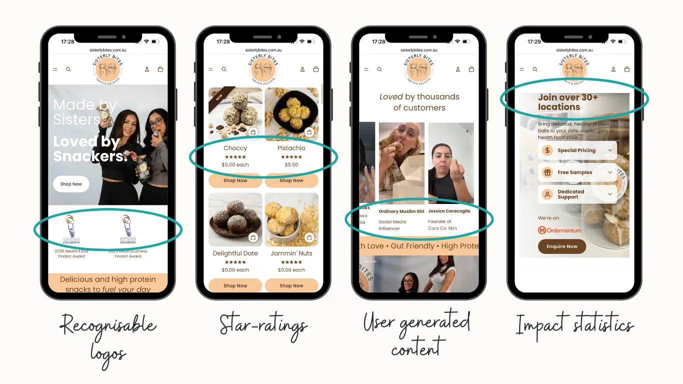 Visit https://sisterlybites.com.au/ to see how to build trust throughout the entire page.
4. The copy speaks to the customer, not the company
Weak sites talk about themselves: “we’re passionate, we’re innovative.” Strong sites position the customer as the hero and the brand as the guide that solves their problem. Every section answers “what’s in it for me?“
5. Navigation matches how people actually think
High-converting sites use plain, customer-language labels and shallow menus. You never have to guess where something lives. Cluttered mega-menus and clever-but-cryptic labels are a reliable conversion killer.
6. The page loads fast… on a phone
In teardown after teardown, the underperformers are slow, especially on mobile. Converting sites treat speed as a feature: compressed images, lean code, and a mobile-first layout because that’s where most visitors arrive.
7. Mobile isn’t an afterthought
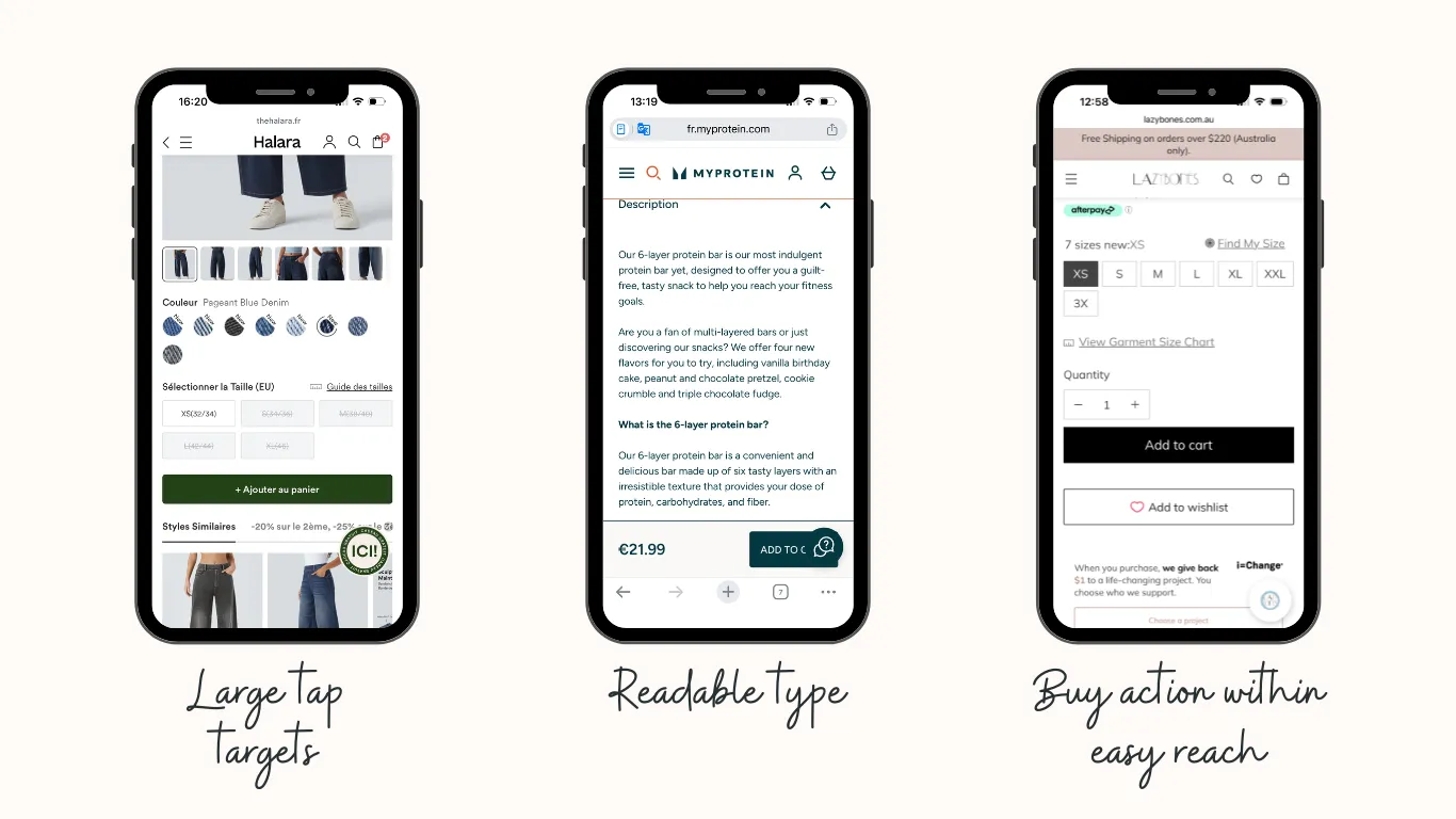
The best sites are designed for the thumb first with large tap targets, readable type without pinching, and a buy action within easy reach. Sites that shrink a desktop layout onto a phone leak the majority of their traffic.
8. Friction is removed, not added
Converting sites minimise the steps between intent and action: guest checkout, fewer form fields, no surprise costs late in the flow. Each removed obstacle is a small conversion gain that compounds.
9. Proof is specific, not generic
“Trusted by thousands” converts worse than “4,812 stores audited” or a named customer result. The high performers quantify their claims and show real outcomes rather than vague reassurance.
10. The site is never “done”
The biggest mindset difference: top sites treat the website as a living asset, not a launch-and-forget project. Continuous testing, measuring, and refining is what keeps them converting while competitors stagnate.
How to run your own teardown
You don’t need a redesign to apply these. Open your homepage on your phone and score yourself honestly on all:
- Five-second clarity
- One obvious CTA
- Early trust
- Customer-focused copy
- Speed.
Wherever you hesitate, that’s a problem.

Want a teardown of your site with the highest-impact fix flagged first?
Run a site check-up, and we’ll show you exactly where your site falls short of the high-converters.