12 Website Usability Mistakes That Hurt Sales
By Emma Pugsley, Co-founder ·

Most stores don’t lose sales because of one catastrophic flaw. They lose them to a dozen small usability mistakes that frustrate shoppers until they leave. Even minor errors in layout, text, or images can undermine trust and drag down conversion. Visitors won’t think twice before leaving a site that’s slow, confusing, or annoying to check out on.
Here are the 12 most common ones and how to fix each…
1. Complicated navigation
Deep menu hierarchies force shoppers to click through layer after layer to find anything.
- Keep navigation shallow
- Use clear category labels
- Add a visible search.
The easier it is to explore, the more likely they are to buy.
2. Slow loading times
Every extra second of load time increases bounce and erodes trust.
- Compress images (We recommend using WebP format because it maintains quality with a low file size)
- Cut unnecessary scripts (If an app isn’t helping a user buy, delete it)
- Enable caching
- Lazy-load below-the-fold content.
Speed is the most invisible conversion killer on this list.
3. Poor mobile optimisation
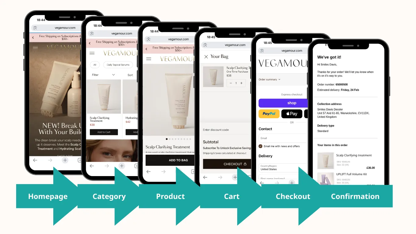
Non-responsive layouts with tiny buttons and distorted images push mobile shoppers (the majority of your traffic) straight to the exit. Adopt a mobile-first responsive design with large tap targets. And test your full user flow on a real mobile, not just the website builder!
4. A buried or weak call to action
If a shopper has to hunt for the next step, you’ve already lost momentum. Make your primary CTA visible, high-contrast, and free of competing buttons around it.
5. Forcing account creation
Demanding a registration before checkout is one of the most reliable ways to lose a ready buyer. Offer guest checkout and invite account creation after the purchase.
6. A long or confusing checkout
Too many steps, too many fields, and surprise costs late in the flow drive abandonment.
- Trim form fields (only ask for what is necessary)
- Show a progress indicator
- Be transparent about shipping and fees up front.
7. Hidden or unclear pricing and costs
Unexpected shipping or tax at the final step is a top reason carts get abandoned. Show total costs early so there are no nasty surprises at the finish line.
8. Weak or missing trust signals
No reviews, no security badges, no clear policies will cause shoppers to hesitate exactly when you need them to commit. Place reviews, secure-checkout badges, and clear shipping/returns info where decisions happen.
Get tips on optimising trust content on your product pages: https://www.youxyoui.io/blog/product-page-optimization/

9. Low-quality or sparse product imagery
Shoppers can’t touch your product, so images do the selling. Single, low-resolution photos leave too much uncertainty. Use multiple high-quality angles, lifestyle shots, and zoom.

10. Walls of text and poor readability
Dense paragraphs, low colour contrast, and cramped type make pages exhausting to read. Break content into scannable chunks with clear headings, bullets, and generous spacing.
11. Useless search and dead-end “no results”
If on-site search can’t handle typos, synonyms, partial terms, or dumps shoppers on a blank “no results” page, you lose high-intent buyers. Add autocomplete and always suggest alternatives.
12. Visual clutter and intrusive pop-ups
Stacked banners, auto-playing pop-ups, and competing widgets overwhelm shoppers and slow the page. Keep one clear primary action per screen and use pop-ups sparingly and respectfully.
Where to start
You won’t fix all twelve at once, so triage. The biggest, most common offenders are speed, mobile experience, and checkout friction. Fix those first because they affect every shopper on every visit. Then work through navigation, trust signals, and imagery.
The hard part is spotting your own mistakes; we get blind to the flaws we live with daily. Run a site check-up, and we’ll flag the usability issues costing you sales (ranked by impact), so you know exactly what to fix first.