10 Reasons Your Conversion Rate Is Low
By Emma Pugsley, Co-founder ·
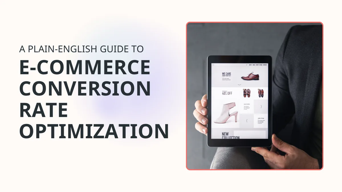
Most e-commerce stores don’t have a traffic problem. They have a conversion problem. The average e-commerce site converts just 2–3% of visitors into buyers, meaning 97 out of every 100 people leave without buying. If your numbers are below that, your store is telling visitors to go elsewhere. Here’s why.
Why your conversion rate matters
Your conversion rate is the clearest signal of how well your store does its job. Traffic is easy to buy. Conversion is hard to fake.
A low conversion rate doesn’t just mean fewer sales today. It means every pound you spend on ads, SEO, affiliates, or social is working harder than it needs to. Fix the rate, and the rest of your marketing gets more efficient overnight.
1. Slow page speed
Page speed is not a technical nice-to-have. It’s a conversion lever. A one-second delay in load time can reduce conversions by up to 7%. Visitors don’t wait. They leave.
For SMB stores on shared hosting or image-heavy themes, this is the most common silent killer.
✅ What to check:
- Time to first contentful paint on mobile (aim for under 2.5 seconds)
- Image file sizes (compress before uploading)
- Third-party scripts and widgets slowing the page
- Core Web Vitals score in Google Search Console
- Start a speed test with an audit from you x you i

2. Unclear value proposition
Visitors land on your homepage and ask one question: “Why should I buy here instead of somewhere else?” If your site doesn’t answer that in the first five seconds, they move on.
The most common reason stores lose visitors at the top of the funnel isn’t price. It’s confusion.
✅ What to check:
- Is there a clear headline on your homepage that states what you sell and who it’s for?
- Does your above-the-fold section explain your differentiation?
- Are you leading with features when you should be leading with outcomes?
- Is the value proposition visible without scrolling on mobile?
3. No trust signals
Shoppers don’t know you. That’s the starting position. Every unfamiliar store carries a risk in the buyer’s mind… is this legit? Will it actually arrive?
Up to 19% of shoppers abandon carts because they don’t trust the site with their card information, according to Baymard research. That’s a trust problem, not a product problem.
✅ What to check:
- SSL certificate visible in the browser bar
- Reviews or ratings visible on product pages
- Returns and refund policy easy to find
- Secure payment badges near the checkout button
- Physical address or contact information present on the site
- Check your site’s trust signals with an audit from you x you i

4. Poor mobile experience
More than half of e-commerce traffic now comes from mobile. But 62% of mobile sites are still rated mediocre or worse on product page UX, according to Baymard’s 2026 benchmark. That gap is where your sales are going.
Poor mobile experience doesn’t mean broken. It means buttons that are hard to tap, text that’s too small to read, scrolls that go on and on, and forms that feel awkward on a small screen. That’s friction.
✅ What to check:
- Tap targets are at least 44x44px
- Text is readable without zooming
- Navigation collapses cleanly on small screens
- Product images load quickly and display correctly
- The full checkout flow works on a real phone, not just desktop preview

5. Weak product descriptions
A product description has one job: answer every question the buyer has before they think to ask it. Weak descriptions create doubt. Doubt creates hesitation. Hesitation kills sales.
For SMB stores, this usually means copy that’s too short, too vague, too generic, or lifted straight from a supplier.
✅ What to check:
- Does each description explain who the product is for?
- Are materials, dimensions, and specifications clear?
- Does the copy address likely objections (sizing, durability, compatibility)?
- Is there a clear reason to buy now rather than later?
6. Complicated checkout
70% of shoppers abandon their carts on average, according to Baymard’s research across 50 studies. The biggest avoidable causes: surprise costs, forced account creation, and checkout flows that feel too long.
Baymard also found that the average large e-commerce site can improve conversion by 35.26% just by redesigning its checkout. The opportunity is real.
✅ What to check:
- Is guest checkout available?
- Are shipping costs visible before the final step?
- How many form fields does checkout require? (Cut everything non-essential)
- Is there a progress indicator so buyers know how close they are?
- Does the mobile checkout feel as smooth as desktop?
7. No social proof
People follow people. A visitor who sees that others have bought, reviewed, and recommended your product feels safer buying it themselves. Remove that signal, and you’re asking them to trust you on faith alone.
That doesn’t just hurt conversion; it weakens every other part of the funnel.
✅ What to check:
- Are reviews displayed on product pages, not just a separate reviews tab?
- Do you show star ratings in search results (structured data/schema)?
- Are user-generated photos included where possible?
- Do you have any press mentions, awards, or recognisable client logos you can show?

8. Confusing navigation
If a visitor can’t find what they’re looking for within a few clicks, they won’t keep searching. They’ll leave. Navigation isn’t just an organisational problem, it’s a revenue problem.
The most common mistake: too many categories, too much nesting, jargon labels, and no clear path to the bestsellers.
✅ What to check:
- Can a new visitor find your most popular product in two clicks from the homepage?
- Is search visible and functional?
- Are category names plain language (not internal jargon)?
- Does the mobile menu work cleanly without extra scrolling?
- Is there a clear path back from product pages to category pages?
9. Weak or missing CTAs
A call to action tells a visitor exactly what to do next. Without a clear CTA, visitors stall. They look around, see no obvious next step, and leave. Make the action clear and impossible to miss.
For SMB stores, this often means a single “Add to cart” button that’s the wrong colour, the wrong size, below the fold, or not sticky.
✅ What to check:
- Is your primary CTA above the fold on product pages?
- Is the CTA button visually distinct from the rest of the page?
- Does every page have exactly one primary action you want the visitor to take?
- Are CTAs present on category pages, not just product pages?
- Does the CTA text say what happens next? (“Add to cart” beats “Submit”.)
10. Too much friction at key decision points
Every extra click, form field, pop-up, or decision the buyer has to make is a chance to lose them. Friction compounds. Each small annoyance stacks on the last until the visitor decides it’s not worth it.
It’s not about having a perfect site. It’s about removing the obstacles that stand between a willing buyer and a completed purchase.
✅ What to check:
- Do pop-ups appear before the visitor has had a chance to engage?
- Are there unnecessary steps between “add to cart” and completing the order?
- Are there competing CTAs on the same page pulling attention in different directions?
- Does the site require a login to view prices or continue shopping?
- Are there visible error messages in checkout, or do failures happen silently?
Final takeaway
A low conversion rate is almost always a fixable UX problem, not a product problem. The reasons above show up again and again across SMB stores, not because small businesses aren’t trying, but because these issues are easy to miss when you’re close to your own store. Run a check against each point above. The most impactful fixes are usually the most obvious ones.