Shopify Conversion Rate Optimization: The Essentials
By Emma Pugsley, Co-founder ·
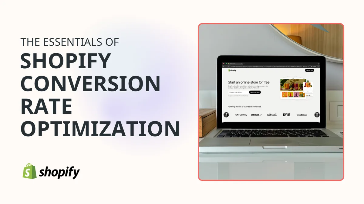
Shopify conversion rate optimization is the work of turning more store visitors into buyers without relying on more traffic. For Shopify stores, that usually means improving the product page, reducing friction in the purchase path, making the site trustworthy, and improving the whole experience on mobile.
This guide focuses on the Shopify-specific basics that matter most. The goal isn’t to repeat generic CRO advice, but to show what is worth fixing first inside a Shopify store and why those changes usually move the needle fastest.
Why Shopify CRO matters
Shopify makes it easy to launch a store, but that doesn’t mean the store is ready to convert. A lot of Shopify brands end up with traffic, apps, themes, and pages that all exist together but don’t work together very well.
That’s where CRO matters. It helps the store keep the traffic it already paid for by making the path from product view to purchase clearer, faster, and less annoying.
1. Start with the product page
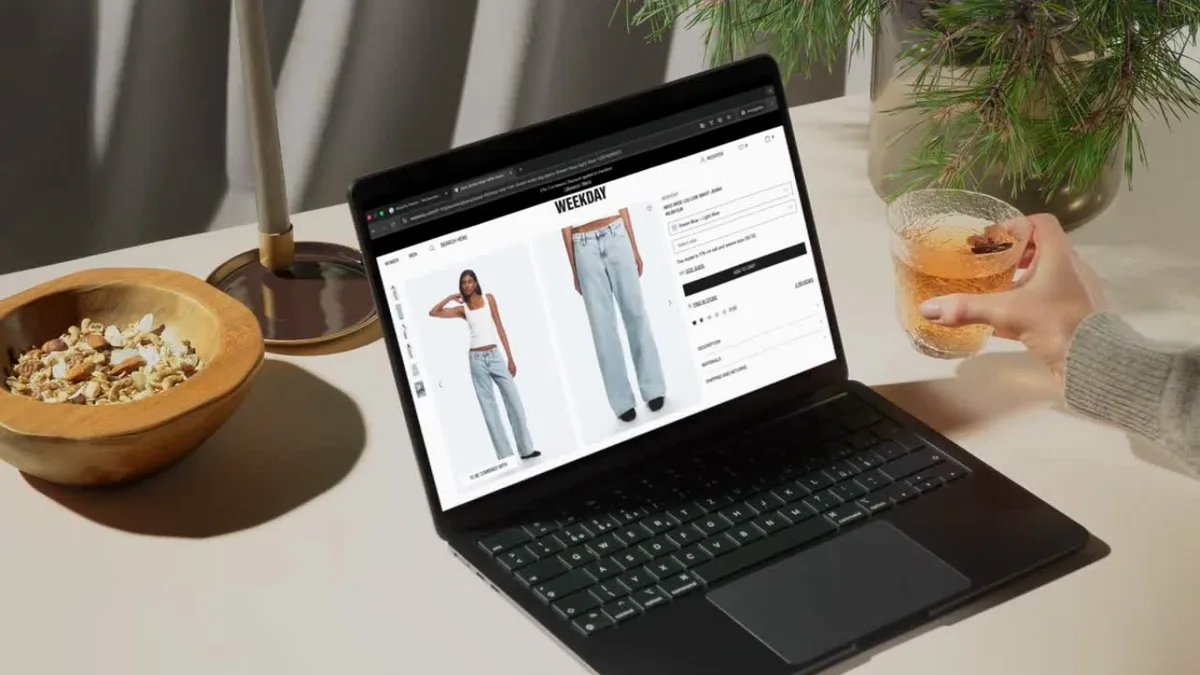
On Shopify, the product page is usually the biggest conversion lever. It’s where the buyer decides whether the item is worth their money, whether the brand feels credible, if they should keep going, and even if they should mention you to friends!
The best product pages make the offer obvious fast. They show the product clearly, explain the value in plain language, give the shopper enough reassurance to act, and enable them to do so without needing to hunt for answers.
For a deeper breakdown of page-level fixes, read What Makes a High-Converting Product Page
2. Make the CTA easier to use
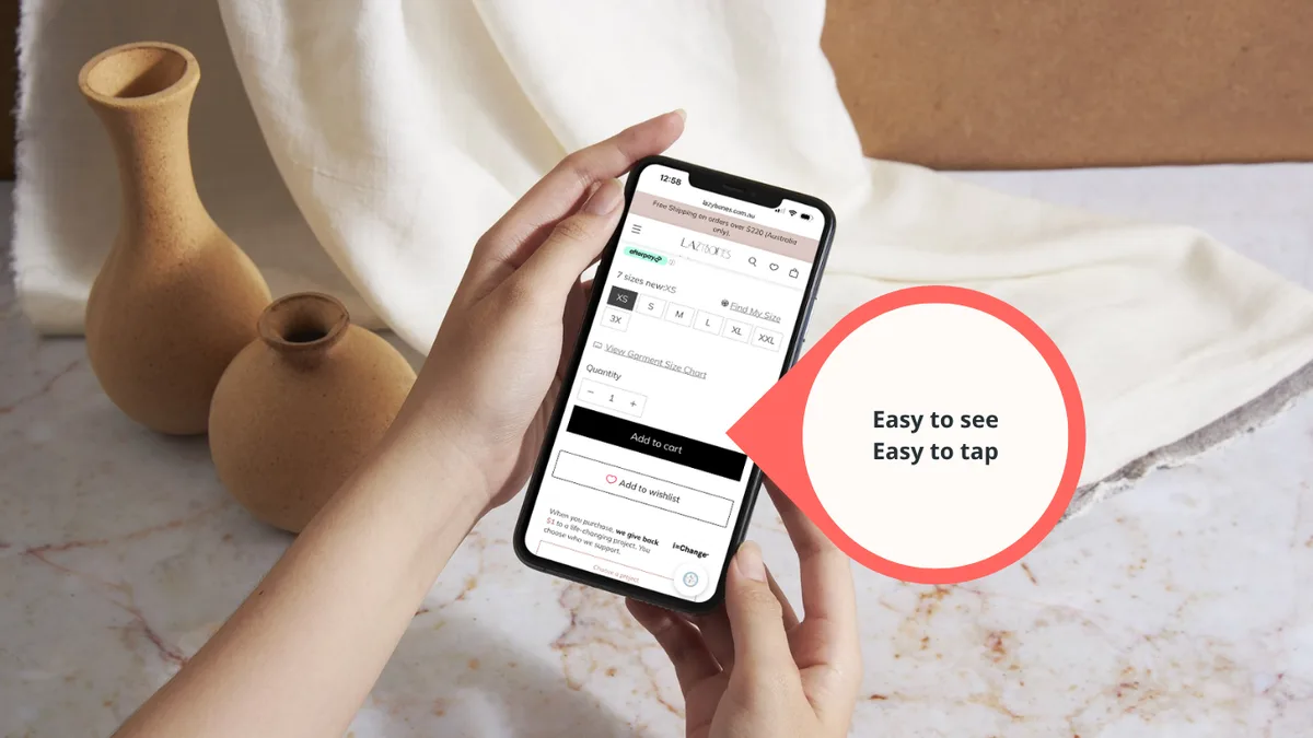
The add-to-cart button should be easy to see and easy to tap. On Shopify stores, this sounds basic, but it still gets buried under weak hierarchy, competing modules like express options, low contrast with surrounding elements, or too much content on mobile.
A strong CTA doesn’t need clever copy. It needs clarity, visibility, enough space around it so the shopper knows exactly what happens next, and be big enough to tap.
3. Remove app clutter
One of the most common Shopify problems is app bloat. Every extra app can add scripts, CSS, and load time, and that can make the site feel slower or more fragile than the team realizes.
The fix is not to remove every app. It’s to be honest about which apps actually support revenue and which ones just add noise. If a tool doesn’t help the shopper buy, it deserves a closer look.
4. Treat mobile as the main version
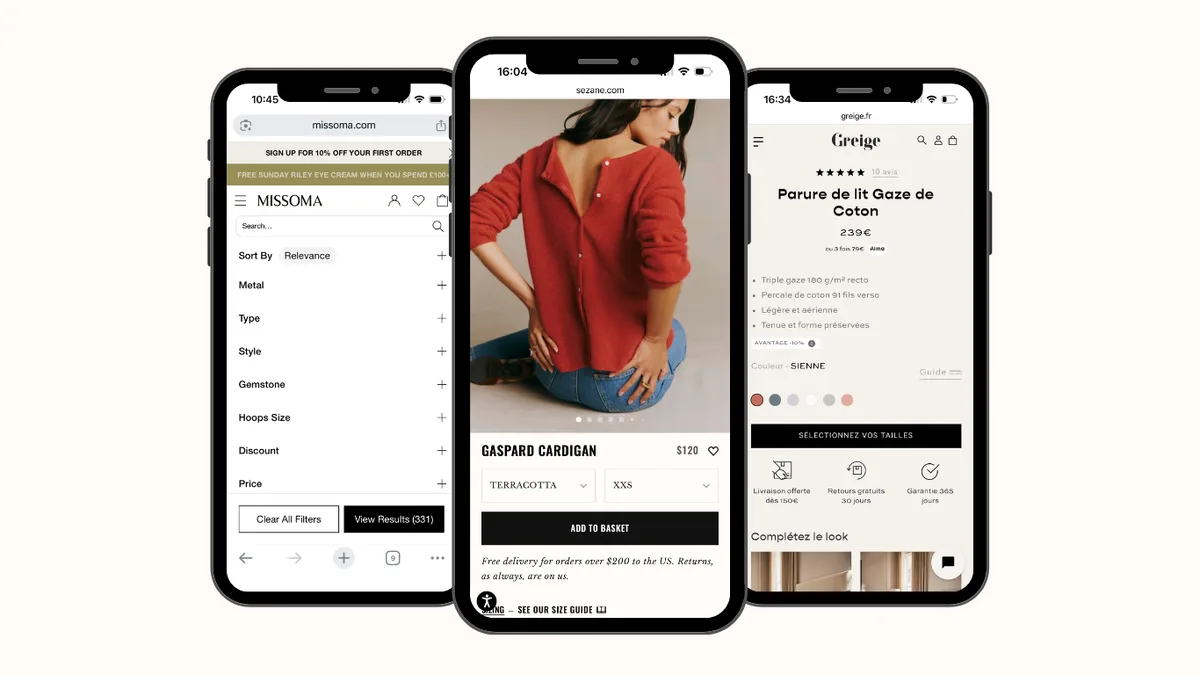
For most Shopify stores, mobile isn’t a side case. It’s where a big share of the buying journey happens, which means the mobile experience has to be treated as the real version of the store, not the scaled-down one.
That means large tap targets, short forms, readable text, and product modules that still make sense on a small screen. If the page feels crowded or awkward on mobile, it will usually underperform even if the desktop version looks fine.
5. Make trust visible near the buy decision
Shoppers don’t want to dig for reassurance. Reviews, delivery details, return information, and support cues should be near the moment of decision, not hidden in the footer or on a separate page nobody reads.
Trust is especially important on Shopify because many stores look polished enough on the surface while still feeling generic or uncertain underneath. A store can have a clean theme and still fail if the buyer doesn’t feel safe enough to commit.
6. Keep the page fast enough to feel effortless
Speed is part of conversion, not just technical SEO. If the store loads slowly, the shopper feels the friction before they even get to the offer, and on Shopify that friction is often caused by too many apps, oversized images, auto-playing videos, or theme choices that are heavier than they need to be.
The practical fix is to keep the page lean where possible. Compress images, remove unused apps, give the user control to play and stop a video, and avoid piling too many scripts into the same template. Small speed gains can make the whole buying path feel smoother.
7. Simplify the buying path
A good Shopify store should make the next step obvious at every stage. The shopper should know where to click, what the price is, what the delivery looks like, and what happens if they buy now.
That’s why the best CRO work usually starts by removing friction rather than adding features. If a page asks for too much attention, too many decisions, too many clicks, or too much time, it usually converts worse than it should.
8. Use collections properly
Collections are a major Shopify lever because they help structure the store around how people browse. If collections are too broad, too vague, poorly linked, or not relevant to the customer’s needs, they end up doing more work than they should.
A strong collection section on a product page should make the range easier to understand and easier to shop. That means relevant product grouping, clearer naming, obvious click actions, and a page layout that helps the shopper move from browsing to choosing.
9. Watch the theme, not just the copy
Shopify conversion issues are often theme issues in disguise. The layout, the section order, the spacing, and the default template all shape how much effort the shopper has to spend before they feel ready to buy.
That’s why product page optimization on Shopify is different from generic product page advice. The platform gives you a theme system, app ecosystem, and template logic that can either help or hurt conversion depending on how it’s set up.
10. Use audits to find the real blockers
The hardest part of Shopify CRO isn’t knowing that the store needs improvement. It’s knowing which part is actually causing the drop-off.
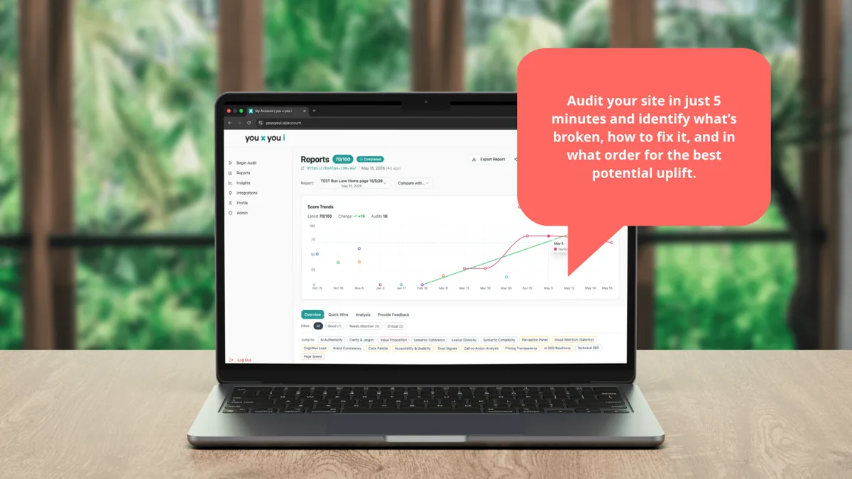
That’s where an audit helps. It can show whether the issue is the product page, theme clutter, mobile friction, app bloat, trust placement, or a combination of all of them.
An audit from you x you i turns Shopify CRO into a simple, plain-English diagnosis instead of a vague list of “best practices.”
What to fix first
If your Shopify store is early or underperforming, start with this order:
- Tighten the product page
- Clean up the CTA and layout
- Reduce app and theme clutter
- Improve the mobile experience
- Make trust easier to see
- Speed up the page where possible.
That sequence works because it focuses on the parts of the store that shape the buying decision most directly. It also fits the way small teams work: practical changes, clear priorities, fixes that can be done internally, and decisions that are data-informed.
Final takeaway
Shopify conversion rate optimization is not about chasing every tactic under the sun. It’s about making the store easier to use and easier to buy from.
For most Shopify stores, the biggest gains come from the basics done well: a clearer product page, a cleaner mobile experience, a simpler buying path, and less clutter around the decision.
If the store already has traffic but sales still feel stuck, the next step is usually not more traffic. It’s a better store.